
Tartine Bakery
Website
Tartine Bakery
Tartine is a bakery and café with a long list of freshly baked items, such as bread, cakes, cookies, etc. In addition, it has breakfast and lunch options in its menu, and it also serves hot and cold beverages like herbal teas, coffees, and hot chocolate. It has dine-in and takeout options and accepts online orders for delivery or pickup.
Goals
-
Improve navigation and order flow to enhance the overall user experience
-
Ensure customers can find items easily and smoothly throughout the shopping process
Problems
-
Content and information are poorly organized, making it difficult for users to understand or navigate the website
-
The order flow—including shopping and checkout processes—is not intuitive or user-friendly, leading to confusion and friction
-
Products are not clearly displayed or well-organized, which negatively affects product discovery and browsing
Timeline
2 months
Team
Group of Three
Tools
Figma, Photoshop
Illustrator
Role
UX/UI Designer
Discover
Heuristic Evaluation

1-The navigation bar is poorly aligned with the site's information architecture, making it difficult for users to find content

2- The menu is poorly structured, making navigation difficult
.png)
3- Inappropriate typography caused readability issues
.jpg)
4- An appropriate footer is missing from the website, impacting navigation and user trust
.jpg)
5- The order page contains too much information

6- The order page is overloaded with information, which may overwhelm users
Since the current website was not functional for users, we decided to redesign it from scratch. Retaining only the products from the old site, we began the new design based on our research findings.
Survey
We conducted a survey to understand users’ frustrations and needs when using bakery websites for online orders. The survey consisted of 9 questions and was completed by 56 participants.
-
The main goals of the survey were to:
-
Understand how users engage with bakery websites.
-
Identify the demographics of bakery product users.
-
Determine what information users expect to find on the bakery websites.
Interview
To gain a deeper understanding of users’ needs and concerns, we conducted interviews with 6 potential customers. Our key findings included:
-
Features users expect when ordering food and drinks online.
-
Common issues users face during the online ordering process.
-
Important details regarding users’ allergies.
-
Preferences for items they want to see on the menu.

Some quotes from people interviewed
Competitive Analysis
We analyzed eight similar websites to evaluate their content and to identify
-
The features they offer on their websites.
-
How their workflows operate.
-
How their navigation bars are structured.
-
How their designs maintain minimalism and effectiveness.

Major Competitive Analysis Takeaways
-
Most websites offer online ordering options, including delivery and pickup.
-
Ingredients and nutritional information are provided on most websites.
-
All websites include product images.
-
Order customization options are commonly integrated into the ordering process.
Define
Affinity Diagram
We created an affinity diagram based on our interviews
.jpg)
Affinity Diagram Takeaways
-
It is important for users to see product pictures along with prices on the website.
-
Most users want the ability to order online.
-
Ingredients play an important role for users with allergies or specific dietary needs.
Persona
We created a persona based on our research. The website was designed to address the persona’s goals, needs, and frustrations.

Site Map
Based on our research results, we developed a site map to structure the website’s information architecture.
.png)
User Flow
The user flow was designed to reflect the steps a customer would take when ordering coffee and cookies from Tartine Bakery.

Design & Test
Sketches and Wireframes
We developed low-fi and mid-fi wireframes as a visual representation of our initial design ideas, derived from brainstorming and research insights.

.png)
UI Kit
To make our website design eye-catching, warm, and fresh, we chose a color palette featuring orange, light brown, gold, and brown. We applied the sans-serif Inter typeface to evoke a sense of simplicity and modernity.
.jpg)
Iterations
After receiving feedback and conducting usability testing, we made several iterations to improve our design.
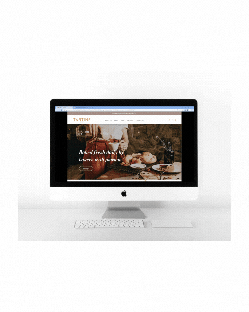
Based on our research and competitive analysis, we decided to enlarge the hero image and place it across the entire homepage. We also added text and a button directly on the image. This change was made to better capture users' attention compared to the previous design.

Since some users may not want to create an account, we removed the prominent “Log In” and “Create Account” buttons. Instead, we provided options to continue as a guest or log in. For those who wish to create an account, the option is still available within the login section.

According to our research, images and prices play a significant role for users. Therefore, we made the product images larger and added prices for each item.

To improve the user experience, we added “Edit,” “Remove,” and “Quantity” options, allowing users to easily modify their order before proceeding to checkout.

Since the “Shop” button caused confusion for some users, we changed it to “Add to Cart".

To make store locations easier to understand, we added an interactive map along with key store information.

Deliver
Final Wireframes
Below are the high-fidelity wireframes and the final prototype.


What I Learned from This Project
-
I learned how to effectively communicate ideas with team members and reach consensus on final iterations based on research and client needs.
-
I understood the importance of feedback and iterations and how to adapt to unexpected changes.
-
I developed skills in managing a team to achieve better results.