.png)
EZ Apply
Redesign of an Educational Admission Website
About EZ Apply
EZ Apply is a company based in Montreal that assists international students in applying to Canadian universities and obtaining visas. The team provides comprehensive guidance and support at every step of the process, from choosing the right program and school to preparing application materials and applying for a visa.

Problems
-
Does not clearly outline its business goals and services.
-
It has an unappealing design and layout that makes it difficult for users to navigate and find the information they need.
-
Does not provide the option for users to book consultation appointments.
-
Has poor usability and an unappealing visual design.
Goals
-
Simplifying the user journey by redesigning an intuitive and easy-to-use interface.
-
Prioritizing key information about university programs and services so users can easily locate them.
-
Reducing confusion and making it easier for users to navigate the website.
-
Creating an appealing personalized experience for users.
-
Maintaining consistency and clarity throughout the website.
Timeline
7 months (part-time)
Team
Group of Three
Tools
Figma, Photoshop
Role
UX/UI Designer
Discover
Heuristic Evaluation
In order to gain a clear understanding of which areas to prioritize in our user research, all team members conducted heuristic evaluations of the website. Based on our analysis, we have identified the following key findings:
1- Navigability
-
There is no navigation bar designed to make it easy for users to find their way around the website.
-
No footer is provided to help users find typical information regardless of where they are on the website.
-
Lack of a site search makes it difficult for users to search the website’s content and services.

2- Accessibility
The website does not separate and clarify content, headers, and call-to-action buttons to show users the most important information and guide them toward their desired actions.
.jpg)
3- Visual Design & Hierarchy
-
The hero image doesn’t appear to be eye-catching and informative at first glance.
-
The slogan is not attention-grabbing and fails to convey the services they provide.
.png)
4- Flexibility and Efficiency in Use
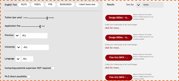
The website does not offer sufficient filtering options to cater to the individual needs and concerns of its users.
.png)
5- Error Prevention
In the application experiences table, UX writing is poor and the information is incomplete, which could lead to confusion and frustration among users.

6- Aesthetic and Minimalist Design
-
There is no summary of the main values offered by the website, especially in terms of specific services.
-
There is a great deal of white space on the pages due to the absence of suitable margins or layouts.
.jpg)
7- Visibility of System Status
The absence of high-priority information on the result card makes it difficult for users to quickly understand the status of the program's outcome.
.jpg)
The font size is not offering good readability and is causing difficulty in reading the content.

Survey
In order to gain a general understanding of the potential users, their concerns, and their needs, we prepared a survey to be filled out by those in the application process or planning to continue their education abroad.
96 people answered the survey.
We asked questions about their demographic information, educational backgrounds, and professions to know them better. Meanwhile, in order to learn more about their intentions and pain points, we asked questions about their preferences and challenges during the application process, such as:
-
Expected guidelines in the admission and visa process
-
Preferred ways of getting the consultation
-
The main features they looked for while choosing a university
.png)
By analyzing user data, we were able to determine what features users look for when choosing a program in university. Some important factors: Funding, Major, University Fees, Professors.

During the admission process, users indicated they need help mostly on:
-
Writing and editing SOP
-
Writing and editing resumes
-
Editing emails to professors
During the general process, users indicated they need help mostly on:
-
Visa approval process
-
Stress management during the application process
%201.png)
Competitive Analysis
To gather information and inspiration, we conducted a competitive analysis by examining websites with similar business plans and studying their features
.jpg)
Major Competitive Analysis Takeaways
-
Providing a wide range of filtering options would allow users to have a more tailored search
-
Adding a comparison tool with predefined metrics to the website would enable users to review multiple programs at the same time
-
In addition to being a competitive feature, offering free resources (videos/blogs) would guide potential applicants through their journey
-
Having a comprehensive profile that contains data such as academic history and past activities (purchases, favourites, etc.) can be considered as a valuable reference
Affinity Diagram
We conducted an affinity diagram to capture the collective knowledge and insights of the potential users and to identify patterns and themes that emerge from their ideas.
.jpg)
Major Takeaways
-
The following points outline the significant findings we can draw from our affinity diagram:
-
Trust is a critical factor for users when selecting a counseling service for university admission and the visa process.
-
University admission and visa application are stressful and challenging processes, and users require guidance in all steps, from preparing requirement documents to reapplying for a visa.
-
Users prefer to have the option of both online and in-person consultations, depending on their preference.
-
Reviews, experiences, and referrals are important for users to build trust in a counseling service.
-
The major, university rank, tuition fee, location, and professor's availability are some of the factors that users consider when selecting a university.
-
Users require close follow-up from counseling services until they receive a positive result.
-
Tutorial videos and learning from others’ experiences can be helpful for users in preparing application documents, including CVs and SOPs.
Define
Persona
Based on user research, the persona is created. The website will be designed based on persona needs and frustrations.
.png)
Storyboard
We made a storyboard and a context scenario in order to have a more profound empathy for the user.
.jpg)
Develop
User Flow
We have worked through the tasks of searching programs, comparing, booking a consultation session, and getting services. Here are the user flows of these tasks.
.png)
Site Map
The information architecture we developed was based on our research and the data that we collected from users.
.png)
Design & Test
Sketches
Sketching helps us to draw our ideas together and move forward in the next stage of the design process based on iteration and testing with users.
.png)
Wireframes
Following the sketches, we created mid-fidelity wireframes in digital form and prepared them for usability testing to find solutions to challenges and user needs. Iterations of the wireframes were conducted to identify potential pain points before diving into hi-fi prototypes.
.png)
Mood board
We created the mood board to inspire creativity and generate new ideas; we chose deep green to reflect a serious, professional look; yellow to reflect an energetic, dynamic vibe; and white and light gray to represent a clean and modern style.

UI Kit
We were able to develop a design system to ensure consistency across all the pages of our product, including typefaces, colors, input boxes, and buttons.
The simplicity of the design is achieved through the use of Inter-typography, white space and minimal items.

Iteration
Usability Tests
In order to reveal possible usability problems and evaluate the design, we did testing rounds of our prototype.
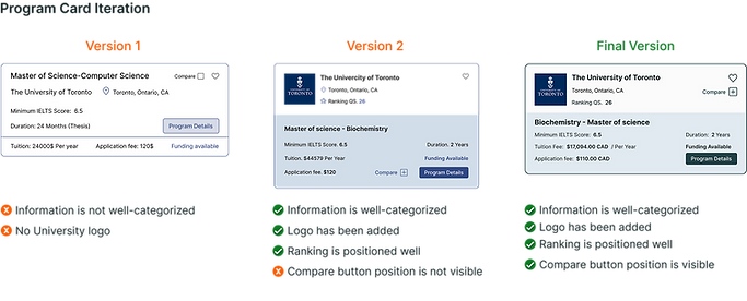
The major iterations are shown below.
.png)
.png)
.png)
.png)
.png)
.png)

.png)
Deliver

.png)


Reflection
What did we learn?
-
To create designs that truly meet the needs of users, it is essential to conduct extensive research to understand their pain points, preferences, and behaviors.
-
The design process is iterative: design is rarely a linear process; it often involves cycles of ideation, prototyping, testing, and refining. how to use tools like wireframes and prototypes to iterate on your designs and gather feedback from users and stakeholders.
-
Collaboration is key: Successful UX/UI design often requires close collaboration between designers, developers, stakeholders, and users. We have learned how to effectively communicate our design ideas and incorporate feedback from diverse perspectives.
-
We have learned that good design also involves creating interfaces that are intuitive, easy to use, and functional. We have learned how to design for usability and accessibility, ensuring that your designs are inclusive and meet the needs of a diverse range of users.
-
Design impacts business outcomes: Ultimately, the success of our design depends on how well it meets business goals and user needs.
What can we do next?
-
Based on competitive analysis, it is an asset to have upfront eligibility tests to prequalify applicants.
-
Adding filtering options to narrow down blogs and tutorial videos based on the subject of interest.